Our brand is our identity.
Our brand defines the core of who we are.
We take pride in defining this identity and our culture that
has led to 50+ years of success. As we continue to grow,
we keep these guidelines to help us stay aligned to our
brand and maintain consistency in all we do.
Our logo is the foremost identifying mark of our brand.
Take good care of it by following the rules.
General Guidelines:
- Use color rules.
Do Not:
- Alter the logo at all.
- Change the logo colors.
- Use effects like glow, dropshadows or textures
on the logo.


The Elo logomark is made up of the Logo Bar
and the Elo word. While the Logo Bar may be used
as a design element, the Elo word should never
appear in this font without the Logo Bar.
Note: Our logo animation that ends each of our
videos contains the Elo logo briefly with the two
elements separated. This is the ONLY use case
permitted to do so.
Be careful to keep the logo integrity by allowing
negative space and keeping the logo consistent.
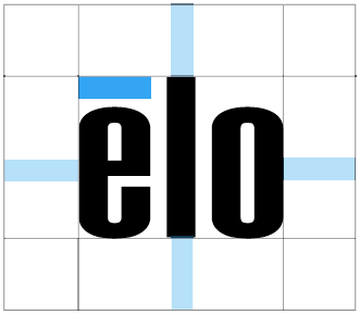
Use the Logo Bar as a guide to
create safe space around the logo.
Never allow elements to encroach
inside this safe space.
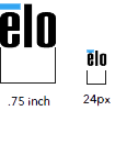
Never print the logo any smaller than .75 inch and never display the logo any smaller than 24px, limiting the small sizes for use cases such as favicons.
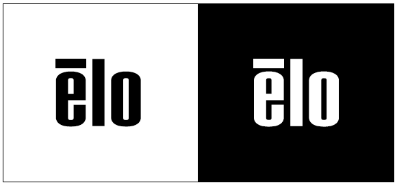
Use the logo in black or white when pairing with colorful other brands, when the logo needs to understated or when printing color is limited.
Avoid these logo mistakes.
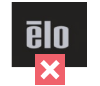
Never distort the logo
by stretching it.
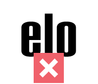
Never remove
the Logo Bar.
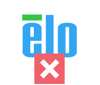
Never change the logo
colors, even if older
versions still exist.
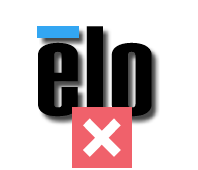
Under no circumstances
should the logo appear
with a drop shadow.
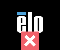
Do not use the Blue
Logo Bar when the logo
must appear in white.
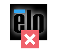
Under no circumstances
should the logo appear
with a glow.
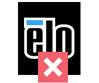
Under no circumstances
should the logo appear
with an outline.
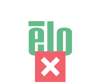
Never choose any
color other than what
is permitted in our
guideline.
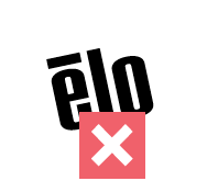
Never rotate
the logo.
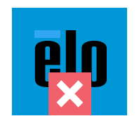
Under no circumstances
should the logo appear
on a blue background
in any form other than
all white.
How to reference Elo when the logo is not being used.
Elo
Pronunciation:
Elo | E·low | \ ē -ˈlō \
“Elo” is our official brand.
In general usage, “Elo” should be used to reference our brand.
Any word immediately following “Elo” should be lower case in nearly all instances unless the word following refers to a specific Elo product (e.g., Elo M60 Pay mobile POS).
“Elo Touch Solutions, Inc.”
is our company.
As our official legal entity, “Elo Touch Solutions, Inc.” should be referenced on all official corporate documentation (e.g., agreements, financial documents, and order forms).
Elo should appear as
one solo word.
Avoid these mistakes:
ELO
Elo Touch
ELO TOUCH
Elo Touch Solutions
ELO TOUCH SOLUTIONS
General Guidelines:
- Use simple styling to create sophisticated typography.
- If Avenir is not available on a particular software system, use Arial and stick to bold headers.
Do Not:
- Use italics in title copy unless in body copy where emphasis is necessary.
Avenir Next Lt Pro is our main font.
We use all weights, especially bold and medium.
Most titles on white should use Dark Gray but it may be paired with Logo Blue.
Arial is our secondary & system font.
It should be used for emails and PowerPoint.
We use all weights, but keeping in mind that bold should
be used for titles
and regular for all body copy.
We’re all about that blue. Our blues are bold, they
create depth, and they stand out.
General Guidelines:
- Use Pantone or CMYK for print.
- Use RGB and Hex for digital.
- Opacity may be used for all colors without straying far from the original color.
Do Not:
- Create disconnect with colors.
- Create slightly off colors from the palette.
Elo Logo Blue
r59g166b239
#3BA6EF
Pantone 2191C
c75m11y0k0
Guidelines:
Logo and text may appear
in this color.
May be used as a bg color.
Light
r51g165b242
#99E0FF
Pantone 304C
c35m0y2k0
Guidelines:
Text may appear in
this color.
May be used as a bg color.
Accent
r51g165b242
#0069ff
Pantone 285C
c90m47y0k0
Guidelines:
Text may appear only
as a CTA color.
May be used as a bg color.
Royal
r0g50b160
#0032A0
Pantone 286C
c100m80y0k12
Guidelines:
Text is NOT used in
this color.
May be used as a bg color.
Midnight
r1g33b105
#012169
Pantone 280C
c100m85y0k39
Guidelines:
Text is NOT used in
this color.
May be used as a bg color.
General Guidelines:
- Use Pantone or CMYK for print.
- Use RGB and Hex for digital.
- Opacity may be used for all colors without straying far from the original color.
Do Not:
- Create disconnect with colors.
- Create slightly off colors from the palette.
Additional colors for all needs.
Dark Gray
r51g65b58
#33353A
Pantone 447C
c70m57y63k65
Blue Gray
r74g62b89
#4A4E59
Pantone 4129C
c73m53y16k20
Medium Gray
r149g152b159
#95989F
Pantone Cool Gray 7 C
c38m29y24k5
Cool Gray
r224g227b234
#E0E3EA
c5m3y0k0
Light Gray
r238g241b247
#EEF1F7
c6m4y2k0
For app UI and other limited, nuanced usages, the accent color palette may be used.
UI Green
r85g177b114
#55B172
c64m3y68k1
UI Yellow
r251g196b95
#FBC45F
c2m22y68k1
UI Red
r240m72y42k0
#F0606C
c1m72y42k0
UI Cyan
c60m0y17k0
#31CDCE
c60m0y17k0
Black
r238g241b247
#000000
c6m4y2k0
White
r238g241b247
#ffffff
c6m4y2k0
General Guidelines:
- Use Pantone or CMYK for print.
- Use RGB and Hex for digital.
Do Not:
- Create disconnect with colors.
- Create slightly off colors from the palette.
Black
r238g241b247
#000000
c6m4y2k0
White
r238g241b247
#ffffff
c6m4y2k0
We use gradients to build depth. Use as backgrounds liberally.
Logo Blue / Accent
Logo Blue / Accent / Royal
Accent / Royal / Midnight
Light / Logo Blue / Accent / Royal / Midnight
General Guidelines:
- Use Pantone or CMYK for print.
- Use RGB and Hex for digital.
Do Not:
- Create disconnect with colors.
- Create slightly off colors from the palette.
Example:
